The challenge
Sarah Turner, from Harrogate Sanctuary, is successfully helping women that want an alcohol-free life. She created a 6 weeks program that works 90% of the time (40% more successful than regular AA – Alcoholics Anonymous). Her approach was based on one-on-one communication and a bespoke program for each woman.
Sarah wanted an app that could scale the impact and help more people live a healthier, better life. Not just for women, but for men too.
According to Sarah’s expertise, we knew that the following are crucial:
- Privacy.
- People need to log their feelings in a diary.
- Notifications to help the user come back to the 6 weeks program each day and stay healthy each day.
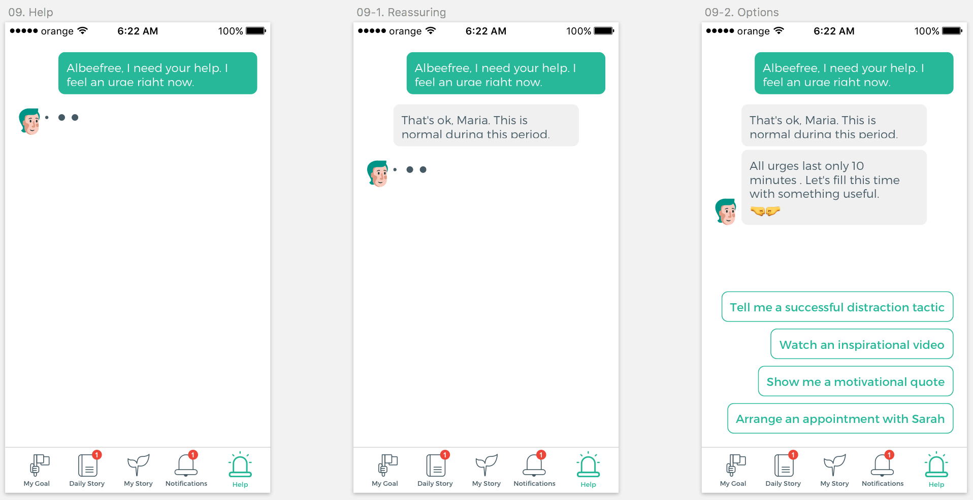
- A feature that would help the user in case of a “panic” situation, in case the person needs to ask for help.
- Bringing Sarah closer to the user.
The solution
Nobody can have the expectation that a digital solution would work as effectively as a bespoke approach. Our ambition was still to come up with a design that would maximize the impact on peoples’ lives.
We will describe in the following sections the steps we took to launch the best solution.
The outcome
We dedicated our entire passion to implement the solution we identified and to make everyone happy. The recommendation Sarah wrote for us will tell you a lot.
After almost a year of talking and negotiating with App developers here in the UK and the USA, I was fortunate enough to find Dolfn, in Romania to develop our App.
Not only is the service impeccable, but the quality of work outstanding, and tremendous value for money.
I have and will continue to recommend their work, the way they take time to explain the complex nature at least for those of us who are not developers with calm and care.
Thank you so very much. I am sure that your dedication will be shown as outstanding once the App is in full flow.
Research
We took our time to do the important research before starting any work. We analyzed the competition, we looked at the approach other apps used. We also looked at the direction technology is going.
The pitch
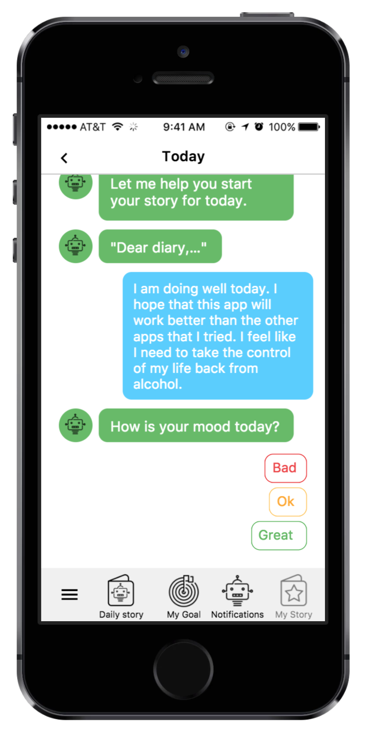
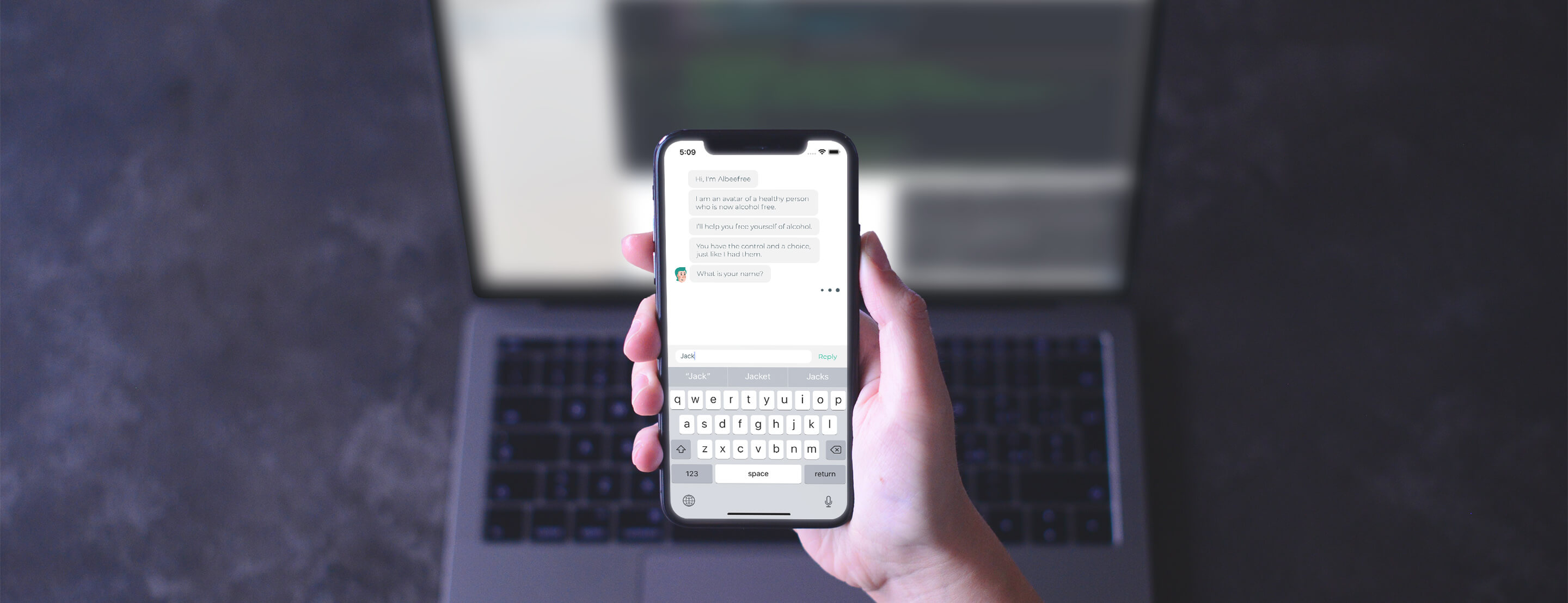
The best idea we found for the Alcohol Free Friend app is to use a conversational interface. It would appeal to the majority of smartphone users, everyone would understand it. Even an older audience according to the research. People could communicate with a chatbot, an avatar of a healthy person, that already followed the program and have the bot guide the user towards a better, alcohol-free life.

We found great benefits that convinced us to use this idea:
- If designed correctly, everyone understands texting and conversational interfaces.
- Even if people know they’re interacting with a robot, they get attached to it. It becomes a more personal interaction, which increases the chances for the user to accomplish his/her goal.
- We can use the conversational interface to ask the user for more information. This way we avoid long forms or unfriendly interfaces.
- We can always adjust the language and the tone to coincide with the brand.
- It would be closer to the one-on-one approach that Sarah used with the people that she worked with. This would also increase the chances of the user to achieve the 6 weeks goal.
- In the future, we can make the bot smarter and use AI to develop more efficient features.
Branding
We see Branding as a very important idea to keep in mind, when designing a product. Since the Alcohol Free Friend app was going to be separated from its mother company, Harrogate Sanctuary, it needed a different brand.
We worked with Roxana Antochi to achieve a great visual system for the brand.
The wireframe
Clarity is always important before starting any more advanced work. This is what this wireframe helped with. We clarified the structure and a general idea of how each feature would work.
As you will see, the final design changed a lot, since we made this wireframe, but that’s because of multiple factors. While crafting the high-fidelity design, we got better ideas for how to implement some details. We also listened to the user feedback in the next stages of design.
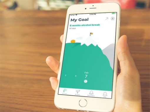
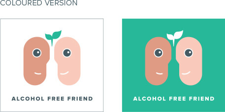
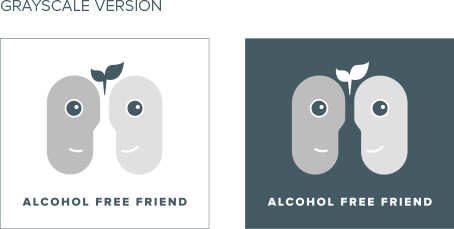
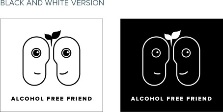
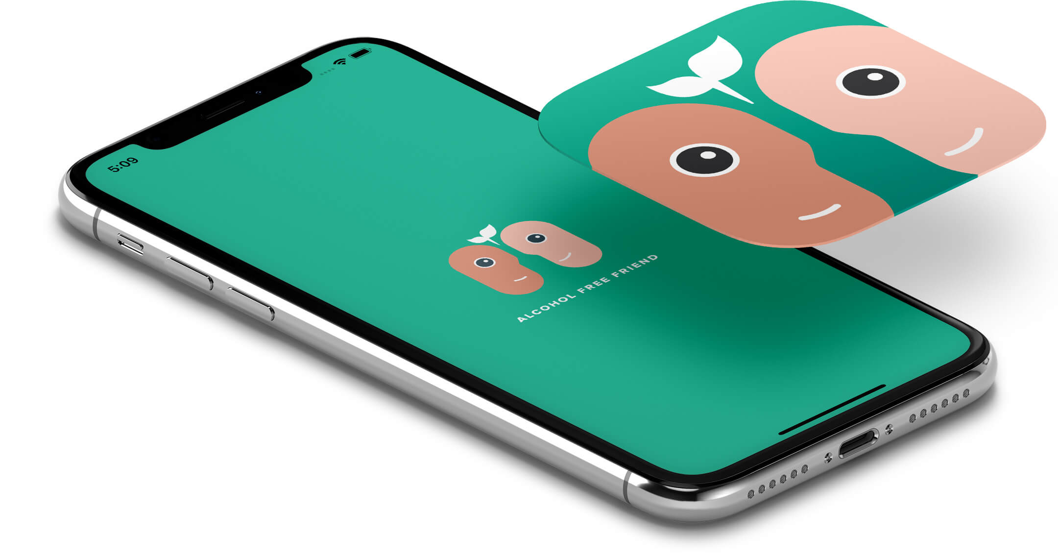
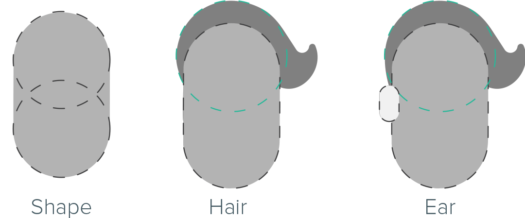
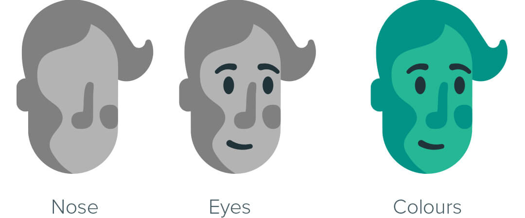
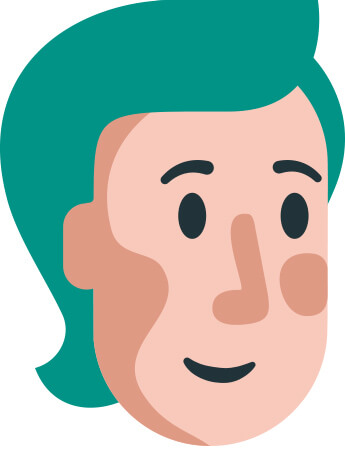
The chatbot
The most important design piece of the app is the bot that the user interacts with. Sarah named it “Albeefree”. We wanted it to look gender-neutral, positive, helpful and, of course, friendly. Its look also had to be derived from the main shapes we created for the “Alcohol Free Friend” visual system. After some iterations and after some user feedback, we reached a good look for Albeefree.
The winner look
After some iterations and more user feedback, Roxana helped us again and designed a great look for Albeefree. It is gender-neutral and achieved all the other goals we had for this avatar.
UI design
After clarifying more about the app, we started working a high-fidelity UI design. This is the stage where we focused on generating better ideas, we paid more attention to detail and we got a great result.
We prepared this design to also be tested, without writing any code. Testing the design with real users is really important. Because we didn’t start coding an untested design, we saved the client a lot of resources. So we prepared each step the user would take and create an organized series of images.
We launched an overall better product because we took this step seriously.
Testing the prototype
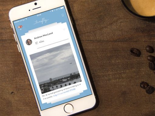
After we completed the UI design, we created an interactive prototype using Marvel. You can check it yourself.
We sent this to some of the potential users and we received valuable feedback. We gave up on some features, redesigned some other parts of the app and reached a final idea for how the final app is going to look like. We were now ready to start coding.
Testing the prototype
After we completed the UI design, we created an interactive prototype using Marvel. You can check it yourself.
We sent this to some of the potential users and we received valuable feedback. We gave up on some features, redesigned some other parts of the app and reached a final idea for how the final app is going to look like. We were now ready to start coding.
iOS app development
In order to change lives and help Sarah do that, we need to deliver apps that have great quality. We made sure to use only the best practices: great, clean architecture, unit tested code.
We launched a couple of beta versions, made some fixes and only after we were sure that we could provide the best experience for the users, we launched the app to the App Store. The result made us proud.
Check out other case studies